Looking to expand his impact and create a better, more effective world for fundraising professionals, author and podcaster, Jason Lewis created Responsive Fundraising. Building on the momentum of his first book “The War for Fundraising Talent”, Jason came to us looking to create a brand identity and website that showcased his revolutionary approach and engaged his target audience.
We took Jason step-by-step through our brand strategy process to formalize Responsive Fundraising’s positioning as a fresh in private philanthropy. Drawing inspiration from Jason’s philosophy and our brand strategy, we designed a visual identity and easy-to-maintain Squarespace website for Jason that gives him the smart and put-together look he was going for.
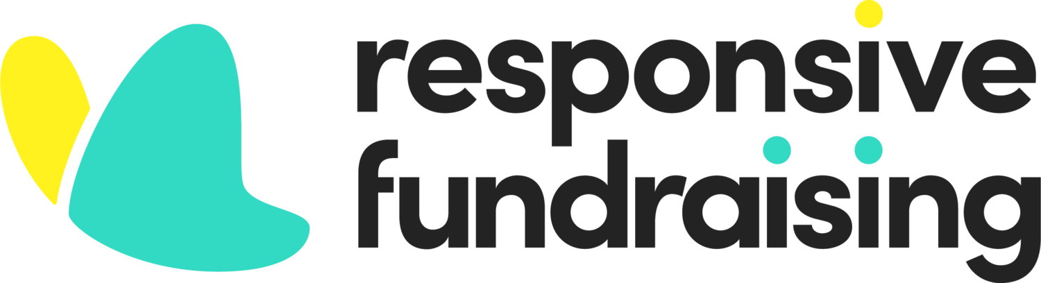
The Butterfly Effect! A central tenet of Responsive Fundraising’s teachings and philosophy focuses on the popular chaos theory concept – in which a butterfly flapping its wings can have a tremendous impact on the other side of the globe. It was fun to see this theory play out across the design. Once we decided on the butterfly icon in the logo, it’s soft, organic shapes inspired the rest of the design. You can notice its shape on the website’s banner images, footer, and graphics throughout the website.
In an effort to differentiate Responsive Fundraising from its competitors (who were using mostly muted blues) we choose a vibrant teal and yellow color palette to give the brand a welcoming, intriguing and exciting vibe. The colors were also chosen with Jason’s target audience in mind — professional women looking for career advancement opportunities in the fundraising sector.