
The Strength in Femininity
Branding and web design for a therapist looking to empower women through mindfulness and evidence-based mental health practices.
The Situation
With more than 15 years of experience as a therapist and licensed social worker, Natalie Lanning knew she had the capability to help women gain better control of their thoughts and gain peace in their daily lives. However, to accomplish this, she needed a brand and website that would connect with her core audience of modern, professional and goal-oriented women.
The Solution
Free the Robot Creative worked with Natalie to narrow down who exactly her ideal client is, what they are struggling with and how best to reach them. We then developed a fresh, modern brand and website that would resonate with her target audience and clearly communicate how Natalie’s expertise could help.
What we did:
Brand Strategy
Logo System Design
Web Design
Illustration
Iconography
Art Direction
Infographic Design


Logo Creation
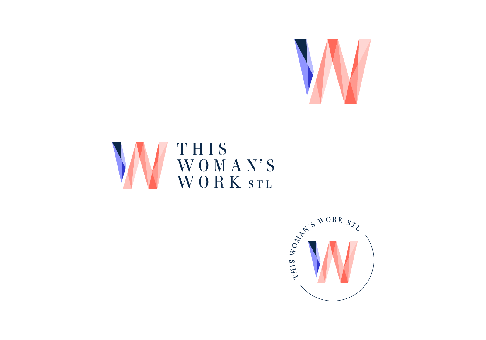
The This Woman’s Work logo features a prismatic “W” to reinforce the alliteration in the brand name.
The icon features a variety of fractured shapes in varying shades of pink and blue. The different shapes — light, dark or somewhere in between — represent the different experiences life can throw at us. Together though, they create something new. Something strong, beautiful and whole.
This icon has been paired with an elegant Serif wordmark. The classic wordmark represents the innate strength in femininity which the brand works to help its clients discover through their own personal journeys and work.
Brand Colors

The bright peach and soft pink colors of the palette stand out in what can be an overly traditional field. They create a friendly, inviting presence for the brand. The navy provides a balancing, professional and reassuring touch.


Brand Typography


Playfair Display serves as the primary brand font for headers and display purposes. The high-contrast serif typeface lends the brand a sense of timeless elegance.
We’ve paired it with Work Sans as for the body copy and subheaders. This easily legible humanist font is clean, modern and perfect for heavy lifting and large blocks of text.

Brand Icons

We created a family of icons to quickly communicate Natalie’s core services.
